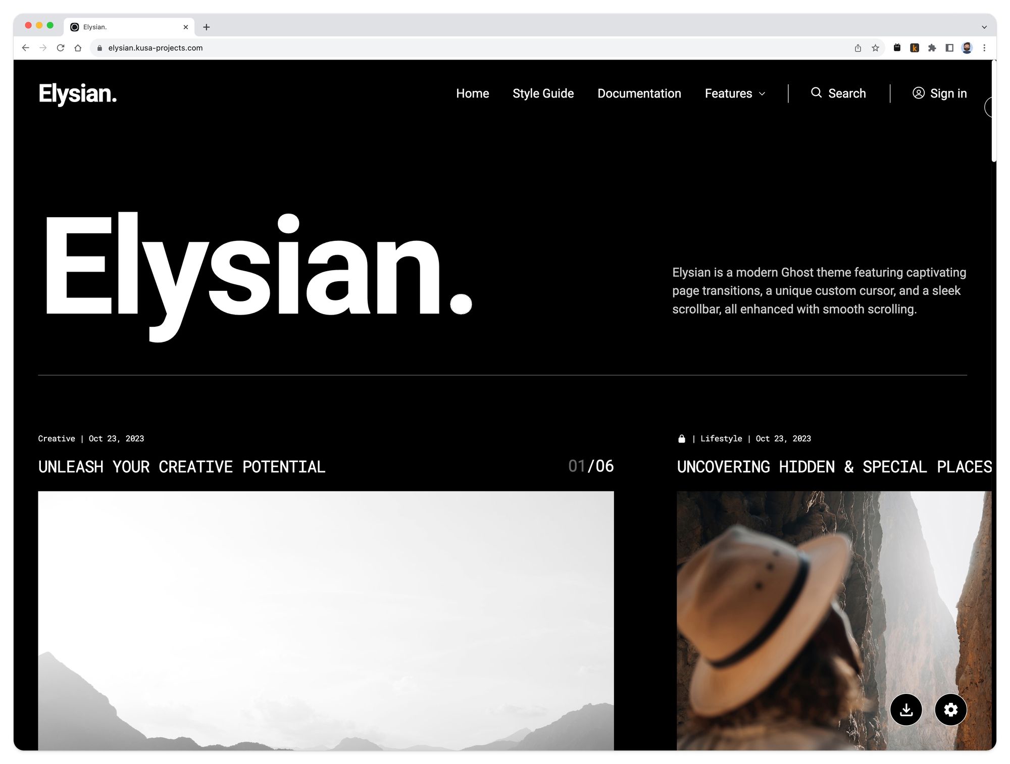
I updated the site theme.
Typical designer-behaviour. I think I had just got the previous theme for the blog fine-tuned when I decided it was time for a change. Let me know what you think?
Enter "Elysian" by the most awesome Tim at KUSA Projects.

This design marks a real shift for Reticulate. More recently I found myself heading down the "newspaper / magazine" style look. Indeed, in it's most recent incarnation it looked and acted very similar to Substack. So much so that I realised I was on a track to "normal" and predictable - not the vibe I'm either feeling or going for.
Elysian just shatters that direction. It is bold, striking and modern (much unlike myself). I think that the nature of the content demands something more creative and I think, for now at least, Elysian delivers.
Plus, this new theme offers a few things I was missing:
- Organisation: The new tag system allows me to structure the home page more clearly by category.
- Design: Our moods change with the seasons, and so does my sense of design! A change is as good a rest, isn't it?
- Navigation: I can now sub-divide my navigation which enables me to tune what is shown, and allow visitors to choose their subject more easily.
- Colour Variables: I can now update the site colours in an instant with the click of a button. Great for those colour-mood-changes. Yay.
Was it worth it?
It is for now, but probably not :)
No doubt I'll change my mind again in a matter of weeks but implementing it has been fun!


